2020 homebuying trends compared through the ages
February 24, 2021

February 24, 2021

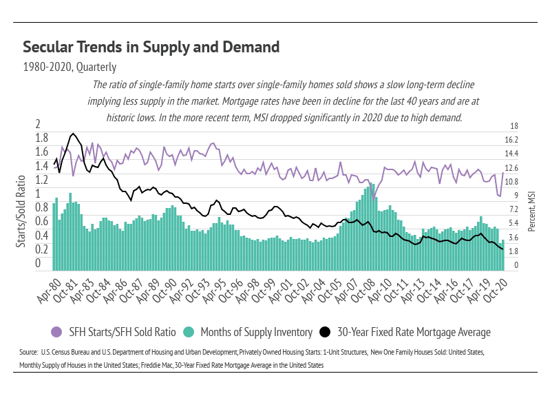
This month, we are taking a step back from discussing short-term trends so that we can dive into secular trends (trends that are neither seasonal nor cyclical) to help us understand the current housing environment. We use three metrics in the chart below—the ratio of single-family home starts (new construction)/single-family homes sold, Months of Supply Inventory, and average 30-year fixed mortgage rates—as they all provide insight into supply and demand. The first two metrics indicate levels of supply and demand. The ratio of single-family home starts to new single-family homes sold indicates the level of production versus demand, while Months of Supply Inventory (MSI) reflects the number of months it would take for the current inventory of homes on the market to sell given the current sales pace. The third metric, average 30-year fixed mortgage rates, shows the cost of financing a home.
1980-1995
The early 1980s marked the highest mortgage rates in the United States—over 18%—as well as the secular decline in rates since that peak. During the 16-year period between 1980 and 1995, the ratio of housing starts to homes sold stayed fairly stable, which is ideal in terms of equilibrium in supply and demand. However, MSI began to shift lower around 1990, indicating that demand was increasing relative to supply. We saw a small peak in MSI in 1995, which declined until the housing bubble began to burst in 2005. During this period, mortgage rates experienced the steepest drop, with an approximately 11% decline. The difference in mortgage payment from 18% to 7% equates to about $10,000 per month in savings on a $1 million mortgage, making homes much more affordable.
1995-2005
This period contained an economic growth cycle. Demand for housing dramatically increased, while the housing-starts-to-new-homes-sold ratio declined and MSI decreased and held at around four months of supply. Credit lending standards during this 11-year period were extremely lax while mortgage rates continued to decline, which further increased demand. Home prices more than doubled from 2000 to 2005. This period marked the beginning of the housing market decline and home appreciation deceleration.
2005-2020
Typically, MSI and the housing-starts-to-new-homes-sold ratio track together, but from 2005 to 2010, they started to show an inverse relationship. MSI rose, while the ratio declined. This happened because, with the Great Recession, demand and new production dropped precipitously and didn’t rebound until 2012. After 2012, the housing recovery began, and we experienced another stable state with fairly steady supply and demand dynamics and consistently low mortgage rates.
During the pandemic and the resulting recession in 2020, mortgage rates fell further, and demand increased dramatically. MSI dropped sharply in 2020 due to high demand and dwindling supply. Mortgage rates have never been lower, which incentivizes more people to enter the market.
The significance of the buying frenzies from 1995 to 2005 and during 2020 is best reflected in the homeownership rate, which also shows the lingering effects of the housing bubble. Home prices started increasing again in 2012, but the homeownership rate declined until 2016. From 2016 to 2020, about half of the homeownership increase occurred in the second quarter of 2020 alone.
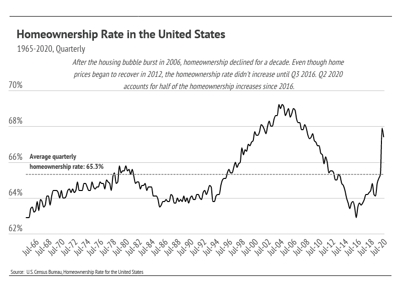
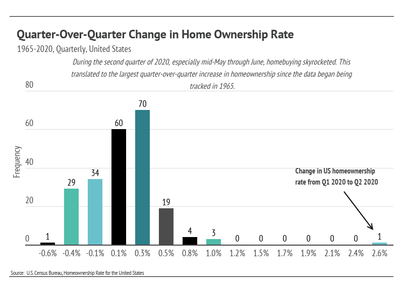
It’s difficult to overstate just how unique homebuying trends were in 2020. The homeownership rate increased 2.6% over a single quarter. For reference, out of 223 quarters, only three other quarters had a change above 1%. This was a gigantic jump.
Although we do not expect the same level of buying in 2021, the environment is right for sustained high demand. Supply remains low, and we anticipate a competitive landscape for buyers over the course of this year.
Stay up to date on the latest real estate trends.

April 22, 2024
Legacy Real Estate Serving San Francisco from Bernal to Sunset

April 16, 2024

April 12, 2024
Buy and Sell Bayview homes

April 4, 2024
You’ve got questions and we can’t wait to answer them.